ABOUT
THIS PROJECT
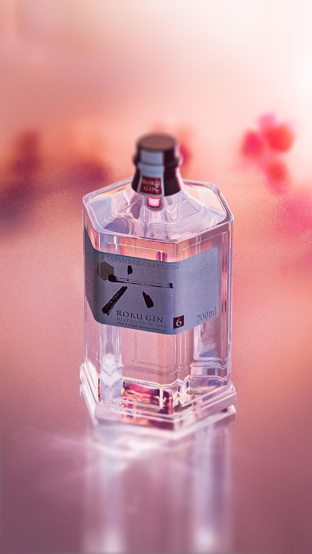
Manifesting the brand truth through our its sacred asset; the bottle.
in collaboration with Senior Design Director, Christian Kolodziejski, we crafted a compelling narrative
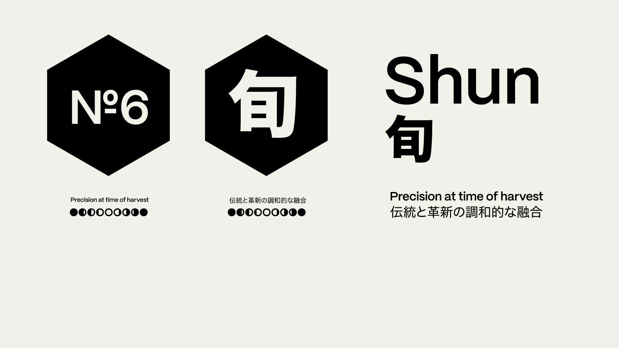
that encapsulates the very soul of Shun within its tangible form. This narrative unfolds gracefully across the six facets of our product, serving as a meticulous compass that reveals the precise moment of botanical harvest.
Our captivating visual language, inspired by the untamed beauty of nature, artfully communicates the essence of our ingredients, the changing seasons, and the exact timing of harvest in a classified and exquisite manner.
We have meticulously forged a design language that embraces the sanctity of Japanese Geometry, seamlessly blending the artistry of craftsmanship, the exactitude of precision, and the simplicity of minimalist modernity.


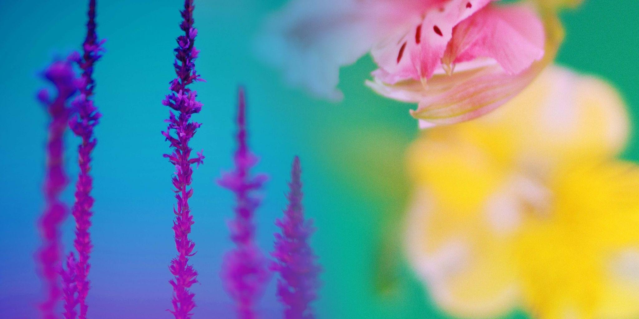


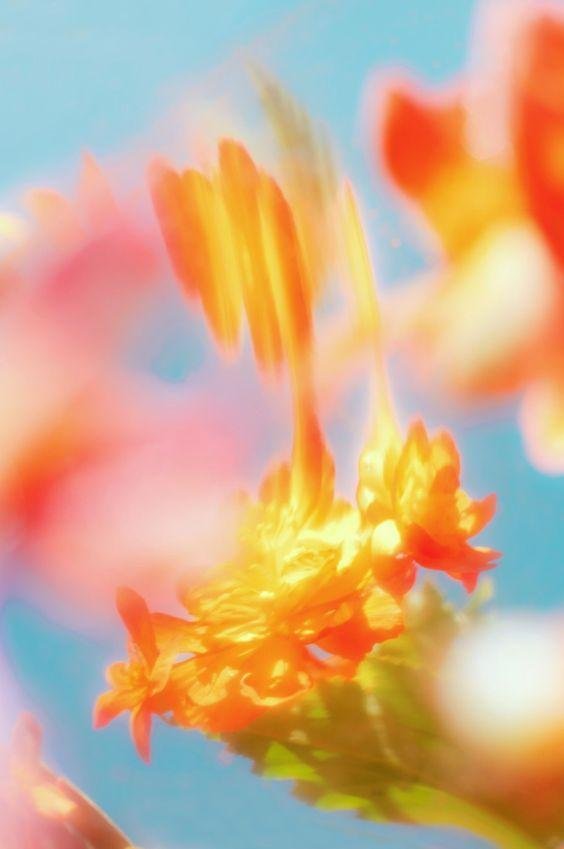

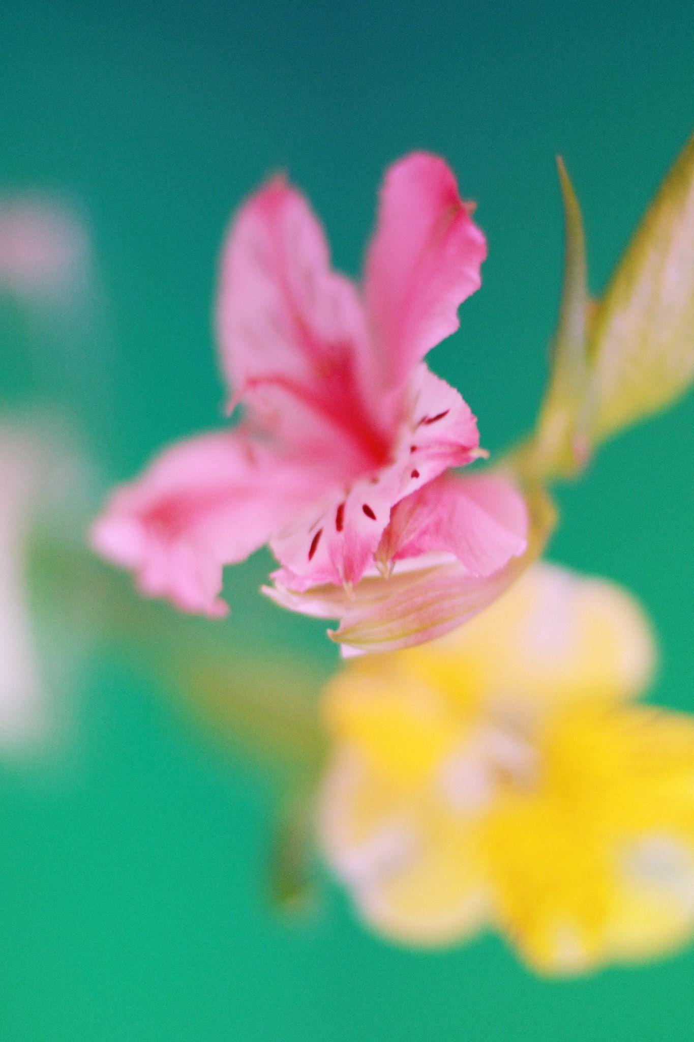
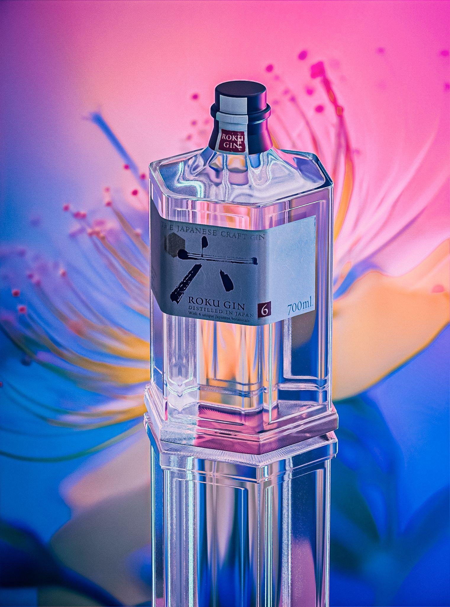
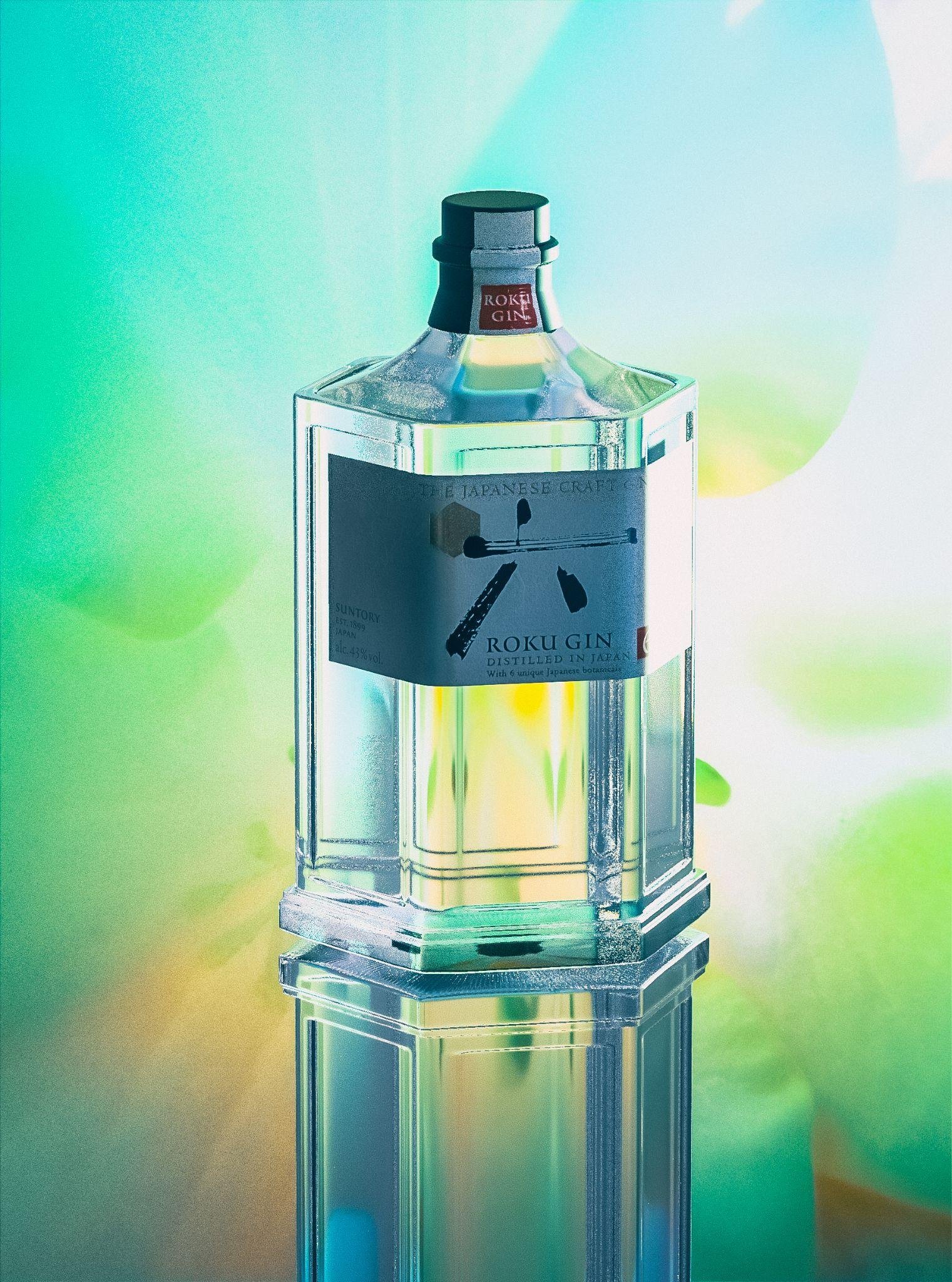
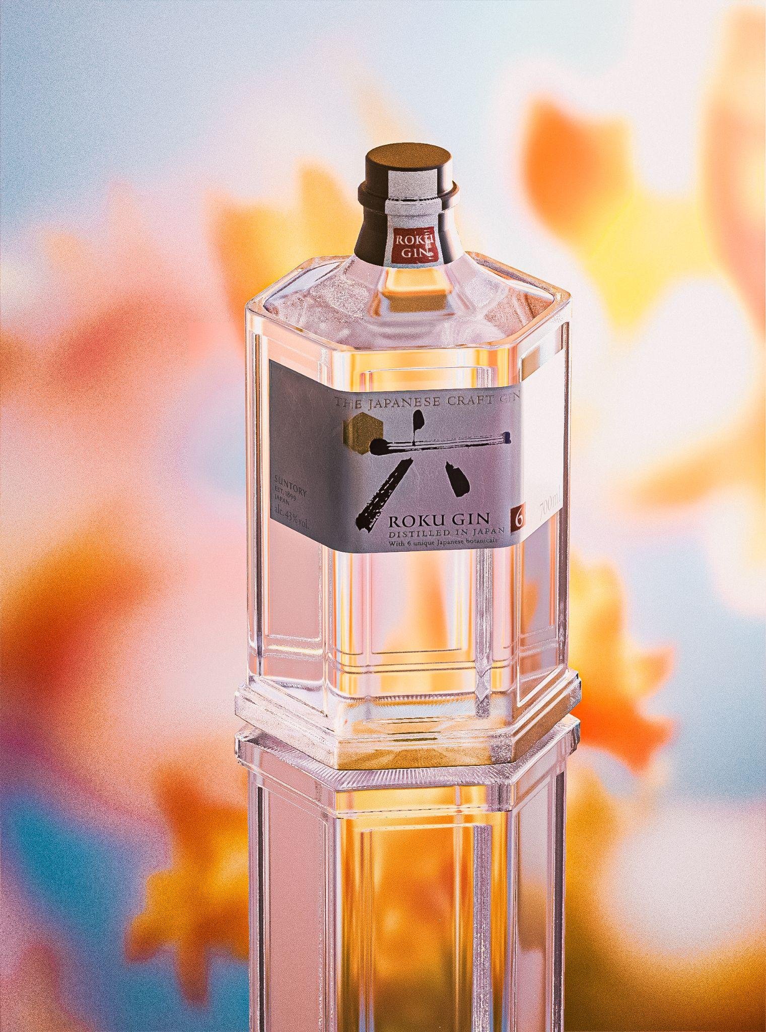
Seasons as strategy
The Roku Gin identity was built with enough flexibility to speak across the year. By anchoring each campaign to a specific botanical harvest, Sansho Pepper in autumn, Yuzu in winter, Sakura in spring, Sencha in summer, the visual language shifts naturally with the seasons while remaining unmistakably the same brand.
In a UK gin market crowded with heritage tropes and illustrative botanical, this gave Roku a distinct rhythm: a product that doesn't just exist on shelf, but moves with nature.